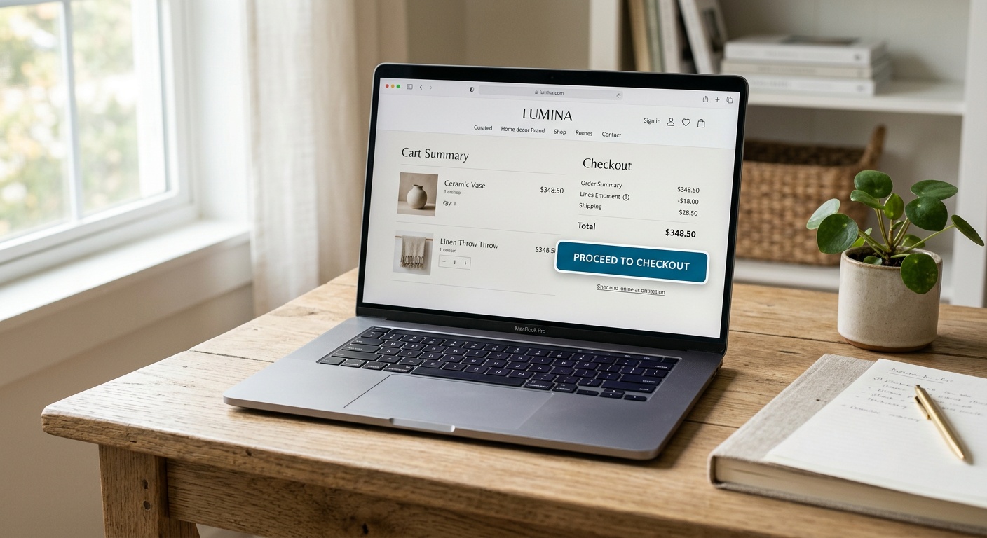
Web Design Elements That Turn Visitors Into Paying Customers
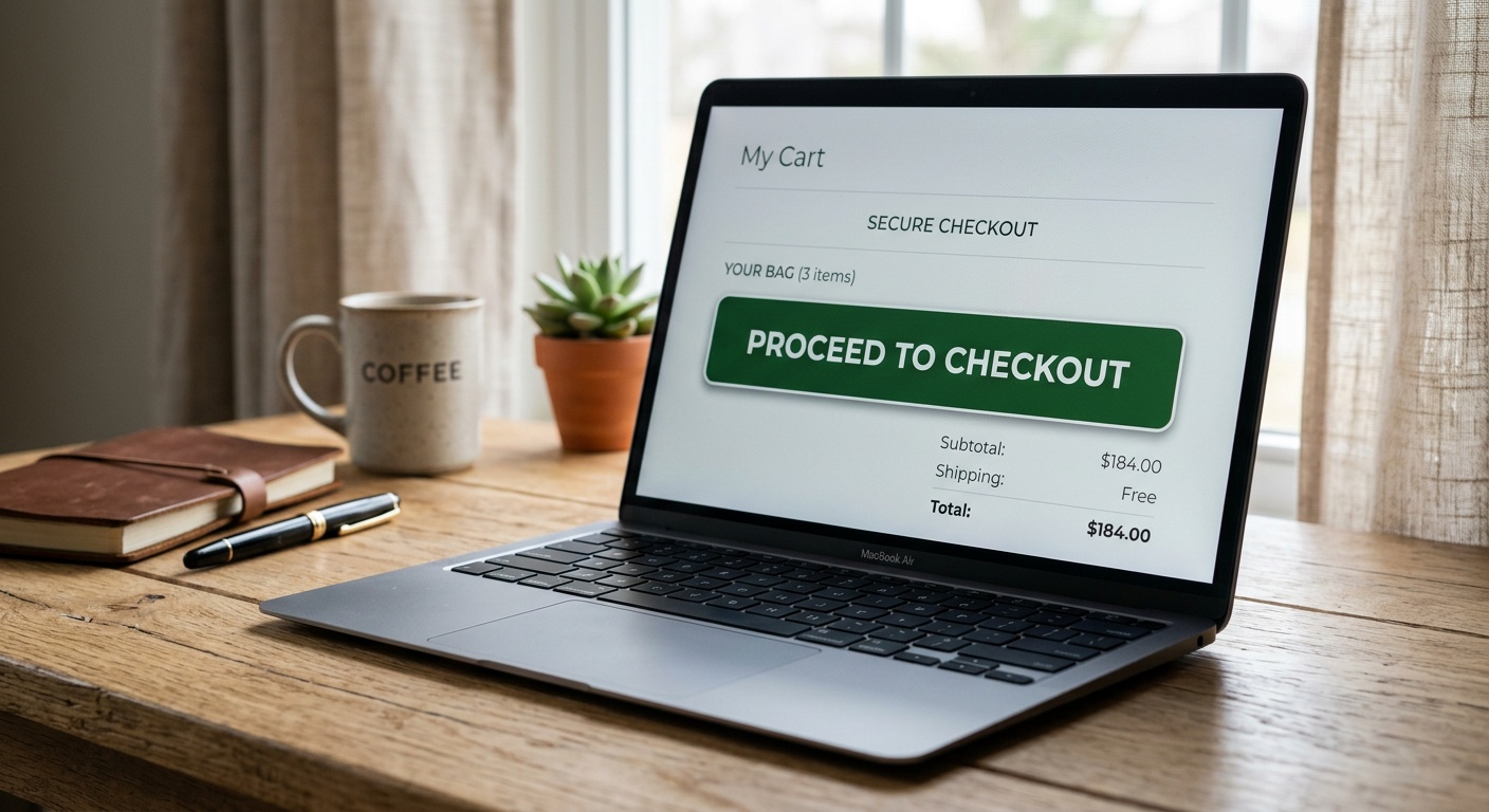
Web Design Elements That Turn Visitors Into Paying Customers
Reading time: 9 minutes
Table of Contents
- Why Most Websites Leak Revenue
- The Psychology Behind Conversion-Ready Design
- Ten High-Impact Design Elements
- Real-World Case Studies
- Common Mistakes That Kill Conversions
- Frequently Asked Questions
- Your Conversion Roadmap Forward
Why Most Websites Leak Revenue
Ever poured budget into traffic generation, only to watch visitors bounce within seconds? You’re not alone. According to a 2026 Baymard Institute benchmark, the average ecommerce site converts just 2.9% of visitors, meaning 97 out of every 100 people leave without buying anything. That’s not a traffic problem—it’s a design problem.
Well, here’s the straight talk: conversion isn’t about flashy animations or trendy color palettes. It’s about strategically removing friction and building trust at every scroll. Let’s break down exactly which design elements move the needle in 2026, and which ones are just digital decoration.
The Psychology Behind Conversion-Ready Design
Humans make snap judgments. Research from Google’s UX team found that users form an opinion about a website’s credibility in 50 milliseconds. That first impression cascades into every decision that follows—whether they scroll, click, or abandon your cart.
Quick Scenario: Imagine two SaaS landing pages selling identical software. One has a cluttered hero section with five competing calls-to-action. The other has a single, benefit-driven headline and one clear button. Which one do you think converts better? Unsurprisingly, clarity wins almost every time—simplified pages routinely outperform cluttered ones by 20-30% in A/B tests.
Trust Signals Matter More Than Ever
With AI-generated scams and deepfake storefronts on the rise in 2026, consumers are more skeptical than ever. A recent Edelman Trust Barometer update revealed that 68% of online shoppers abandon a purchase if a site “feels untrustworthy,” even without a specific reason. Visible security badges, real customer photos, and transparent return policies aren’t optional anymore—they’re baseline requirements.
Cognitive Load Is the Silent Conversion Killer
Every extra decision a visitor has to make increases the chance they’ll leave. This is called cognitive load, and it’s the invisible force behind most abandoned checkouts. Reducing form fields, simplifying navigation, and using progressive disclosure (showing information only when needed) can dramatically lower this load.
Ten High-Impact Design Elements
Practical Roadmap: here are the elements proven to convert browsers into buyers.
- Above-the-fold clarity — a headline that states the benefit, not just the feature.
- Single, contrasting CTA button — avoid competing actions on the same screen.
- Social proof clusters — reviews, testimonials, and usage stats placed near decision points.
- Micro-interactions — subtle hover states and loading animations that signal responsiveness.
- Mobile-first layouts — over 61% of 2026 web traffic originates from mobile devices.
- Sticky navigation with visible cart/contact — reduces friction for return visits.
- Fast load times — every extra second past 2 seconds drops conversions by roughly 4.42%.
- Live chat or AI concierge widgets — instant answers reduce pre-purchase anxiety.
- Transparent pricing tables — hidden fees are the top reason for cart abandonment.
- Exit-intent offers — a well-timed discount can recover 10-15% of leaving visitors.
Pro Tip: Don’t implement all ten at once. Start with load speed and CTA clarity—these two alone often produce the fastest measurable lift.
Comparing Conversion Impact of Design Elements
Feature Comparison: Standard vs. Conversion-Optimized Design
| Metric | Standard Website | Optimized Website |
|---|---|---|
| Average Load Time | 4.8 seconds | 1.6 seconds |
| Cart Abandonment Rate | 71% | 44% |
| Mobile Bounce Rate | 58% | 27% |
| Average Conversion Rate | 2.1% | 5.9% |
| Customer Trust Score (survey) | 6.2/10 | 8.7/10 |
Real-World Case Studies
Case Study 1: The Skincare Startup That Simplified Its Way to +38% Revenue. A boutique skincare brand redesigned its homepage in early 2026, cutting five navigation items down to three and replacing a rotating banner carousel with a single static hero image and one CTA. Within eight weeks, conversion rates rose from 1.8% to 2.5%, translating to a 38% revenue increase without spending an extra dollar on ads.
Case Study 2: A B2B Software Firm’s Trust-Signal Overhaul. After adding client logos, a live “customers this month” counter, and third-party security certifications near their pricing table, one SaaS company reported a 22% jump in demo requests. Their VP of Growth noted, “We didn’t change our product or pricing—we just made our credibility visible.”
Case Study 3: A Furniture Retailer’s Mobile Checkout Fix. By reducing checkout form fields from 14 to 6 and adding autofill support, a mid-sized furniture ecommerce store cut mobile cart abandonment by 29% in Q1 2026, according to their internal analytics dashboard.
Common Mistakes That Kill Conversions
Even well-intentioned redesigns can backfire. Here are three recurring issues:
1. Too many competing CTAs. When every section shouts “Buy Now,” “Subscribe,” and “Learn More” simultaneously, visitors freeze. Fix: assign one primary action per page section.
2. Ignoring load speed on image-heavy pages. Beautiful photography means nothing if it takes six seconds to render. Fix: use modern formats like WebP or AVIF and lazy-load below-the-fold images.
3. Hiding pricing until the final checkout step. This remains the number one abandonment trigger, cited in over 48% of exit surveys in 2026 retail studies. Fix: display total costs, including shipping and taxes, as early as possible.
Frequently Asked Questions
How quickly can design changes affect conversion rates?
Most businesses see measurable shifts within two to six weeks of implementing changes like CTA clarity or speed optimization, assuming steady traffic volume for statistically significant A/B testing.
Do I need a complete redesign to improve conversions?
Rarely. Incremental changes—simplifying forms, adding trust badges, or fixing load speed—often outperform full redesigns because they reduce risk and allow for controlled testing.
What’s the single highest-impact change for small budgets?
Page speed optimization. It’s typically the cheapest fix (often just image compression and caching) and delivers outsized returns across every other metric, from bounce rate to conversion.
Your Conversion Roadmap Forward
Ready to transform your website from a digital brochure into a revenue engine? Here’s your practical checklist for the next 30 days:
- Week 1: Audit page speed and compress all hero images and above-the-fold assets.
- Week 2: Simplify your primary CTA—one action, one color, one clear benefit statement.
- Week 3: Add visible trust signals (reviews, security badges, transparent pricing) near every purchase decision point.
- Week 4: Run an A/B test on your checkout form, cutting unnecessary fields by at least 30%.
As AI-driven personalization and voice-search browsing continue reshaping user expectations through 2027, the websites that win won’t be the flashiest—they’ll be the ones that respect visitors’ time and trust. Which of these elements will you test first on your own site this week?